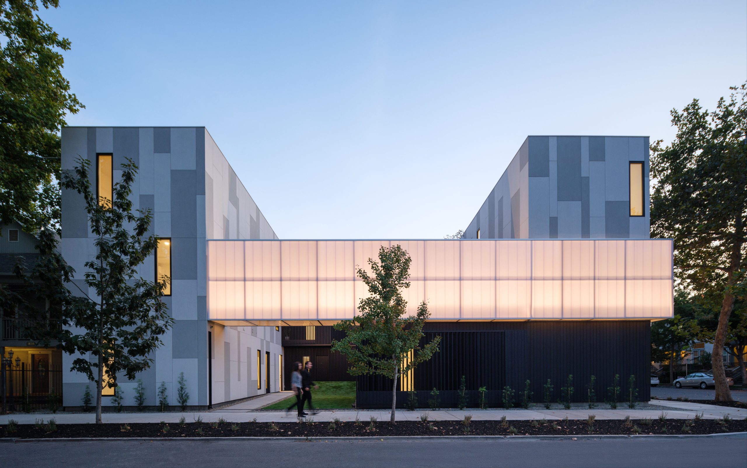
lightBAR

lightBAR is a 13 unit multi family building set in a diverse urban neighborhood of residences, light industrial businesses, a corner cafe, corner convenience stores, and an elementary school.

We created a California courtyard inspired layout, giving light and cross ventilation to every unit. And to activate the courtyard,  a 60’ long screen spans across its entire length. From the inside, movies can be projected onto it for movie nights, or during the holidays it can be the backdrop for party’s, or kids birthdays. So in a way the architecture begins to create a new type of courtyard living.

And from the outside when it’s not in use, it can act almost like a neighborhood beacon, giving identity to the neighborhood. So if you see neighbors in your area, you can tell them, I live over at the lightBAR, you should come over for movie night sometime. So in a way, this architectural feature can become something that can engage a neighborhood to interact.

//comments

A rigorous, cost effective but compelling approach to form for a small infill multi-unit complex. 

//framework for design excellence measures
Measure 1: Design for Integration
The project is located within .25 miles of a lightrail station and provides for bicycling parking on site in lieu of on site parking. This frees the courtyard to be used for people rather than cars. The project utilizes passive sustainable design by designing the building in a courtyard donut shape. The buildings wings are 1 unit wide allowing for natural cross ventilation and light into every unit. Offsite solar is utilized to reduce overall energy consumption of the building. Access to the outdoors is created in the courtyard that people actually use. The is done by creating useable space, intimately scaled space, and attention to detail in material selection, and thoughtful landscaping.
Measure 2: Design for Equitable Communities
Human connection was a major factor in the main design concept of this project. The courtyard, now theater space, becomes the element that triggers the space to be used. These types of design elements and programmatic uses go beyond the typical housing use and create resilient communities. All social activities occur at the courtyard. The ground floor in accessible to people with disabilities, designed with all in mind. The outdoor corridors are a design feature that acts as the backdrop to the court and makes a connection between the court and corridor.
Measure 3: Design for Ecosystems
The project is located in an urban part of California’s State Capitol on a previously dilapidated empty lot. The project incorporates large amounts of drought tolerant planting and the site is mostly gravel, allowing water to remain on site. Various species of plants allow for bees and other fauna to pollinate and utilize plant resources for living in an urban environment.
Measure 4: Design for Water
Stormwater management was a major design discussion at the very beginning of the project. Most of the non built site is pervious with landscaping and gravel areas. Drought tolerant landscaping is used along with a drip system. Low flow fixtures that exceed the code by more than 20% are in the project.
Measure 5: Design for Economy
Lowering costs was a driving factor in this project. A strategic balance of non expensive, locally regional materials offset some of the more expensive design features. Utilizing materials such as cement plaster, standard sized windows, and lower grade knotty rough sawn wood helped to make the project seem of a higher quality. Dimensions for framing were based on off the shelf standard lengths to avoid custom orders. The cement plaster uses integral coloring that does need to be repainted. Where paint is used on metal zinc rich or epoxy coatings were utilized to protect the steel from rusting.
Measure 6: Design for Energy
Sensored LED lighting and energy efficient appliances. Natural daylighting on 2 sides of the units allow for lights to be off during the day. This also allows operable windows on both sides to naturally ventilate the units. Communal spaces are both exterior and interior without HVAC, lighting is controled by occupancy sensors and daylight sensors. Off site solar was designed to off set approximatly 40% of the energy use of the building. Increased envelope insulation and a light colored roof reduce heat gain and energy usage.
Measure 7: Design for Well-Being
Natural filtered air is supplied to each unit through mechanical ventilation as well as operable windows on 2 sides, allowing natural cross ventilation. Natural daylighting on 2 sides of the units allow for lights to be off during the day. Outdoor, protected corrdiors and stairs (no elevator) create an environment of walking. Indoor air quality is increased by utilizing materials that exceed California code required VOC limits and C02 sensors are addtionally added for safety.
Measure 8: Design for Resources
One of the largest factors in minimizing waste resources was designing with standard lumber dimensions, this allowed for very little wood waste to be created. Regionally used materials like cement plaster were used which has minimal waste impact and is integral in color which removes the requirement for repainting. All wood used is from FSC certified sources. All flooring is hardwood flooring and concrete, allowing them to be refinished many times.
Measure 9: Design for Change
lightBAR allows for daytime lighting needs to be met and 24/7 natural ventilation needs to be met in case of a power outage. There is no onsite parking, public transit is within .25 miles, and private bike storage allows all inhabitants to store a bike onsite, allowing multi modal transportation options other than a car. Off site solar in provided which provides approximately 40% of the required building electricity requirements.
Measure 10: Design for Discovery
Post occupancy evaluations have been surrounded by the design concept. Multiple courtyard gatherings have brought the tenants together and we have discussed the successes and pitfalls of the design. Energy usage is on average close to what was designed for, if not slightly less. lightBAR has been a part of ULI and AIA tours in Sacramento to allow others to learn lessons from this project as well.
Skip to content